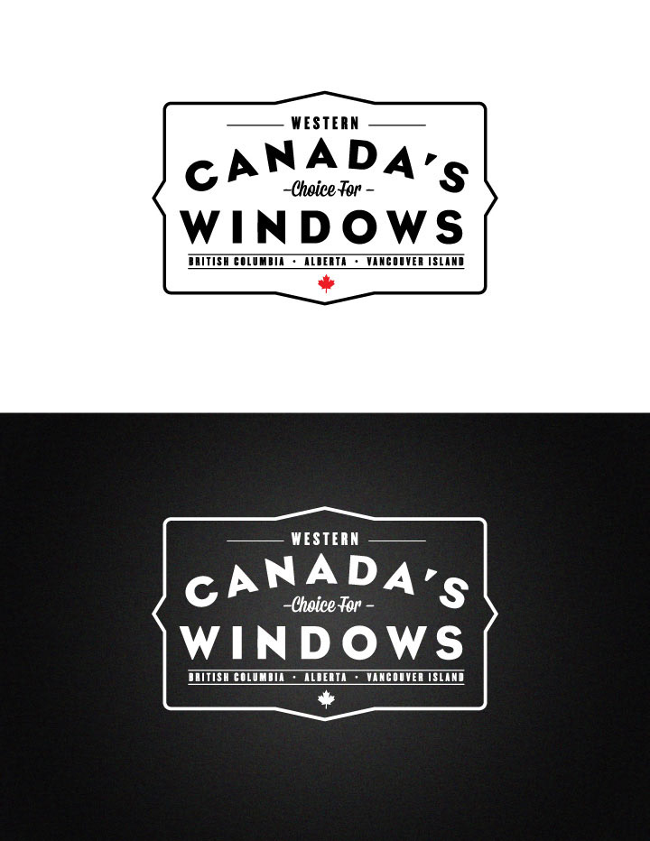
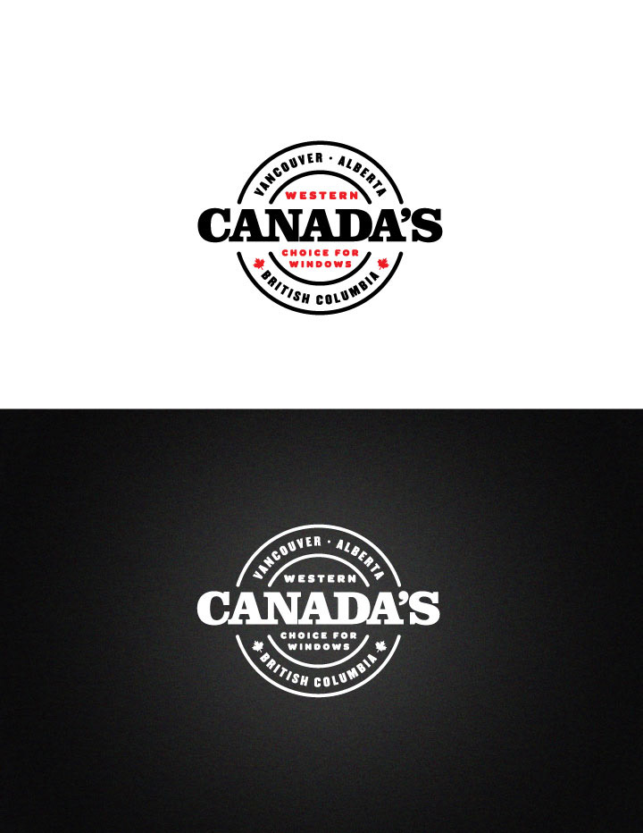
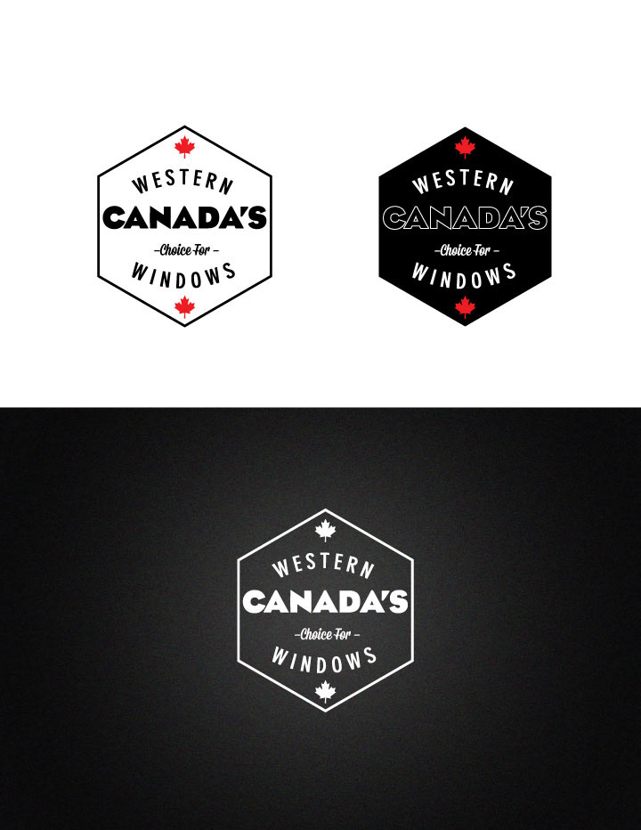
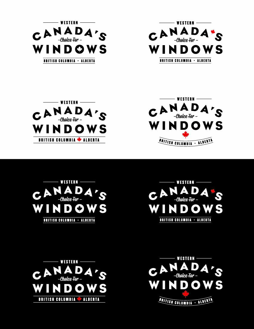
Client liked the first design, but wanted the border and one of the locations removed and some different options for the position of the maple leaf. With those subtractions balancing the remaining elements became tricky.
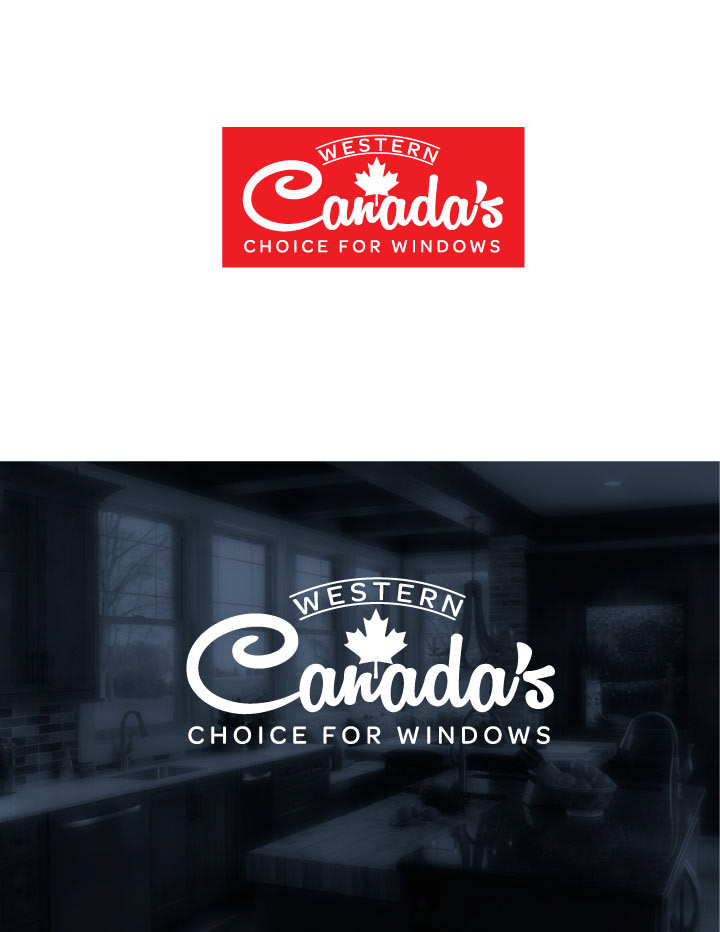
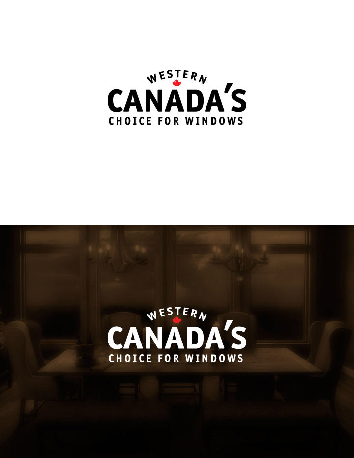
The final logo ended up being just a typographic treatment without a border of any kind.