Rainier Outdoor is a division of Rainier Industries that manufactures handcrafted yurts, canvas cottages, canvas tents, and tipis. They have been involved in this business since 1896 making them one of Washington State's oldest continuously operating companies. As a division of a larger organization, they did not have distinctive branding, but in 2018 they came to me to create a new look and feel to help them own a unique brand position in their industry. The divisions all shared a common logo design that featured the main brand oval logo, the word Rainier repeated, and then the product: Rainier Yurts, Rainier Industrial Art, Rainier Tents, etc. Strategic considerations included creating an ownable identity for the division which it could use to market directly to consumers who love the outdoor life while appealing to both the hardcore "off the grid" folks and the more sedate "glamping" crowd.
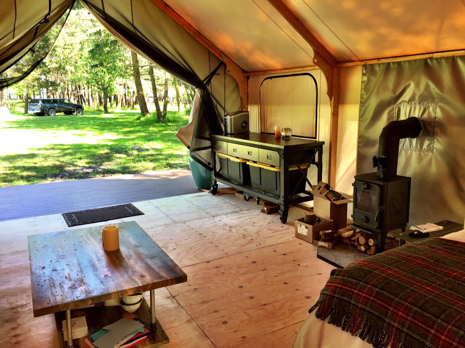
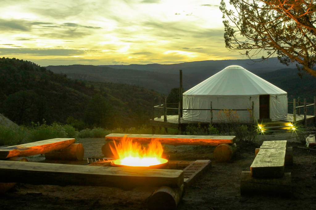
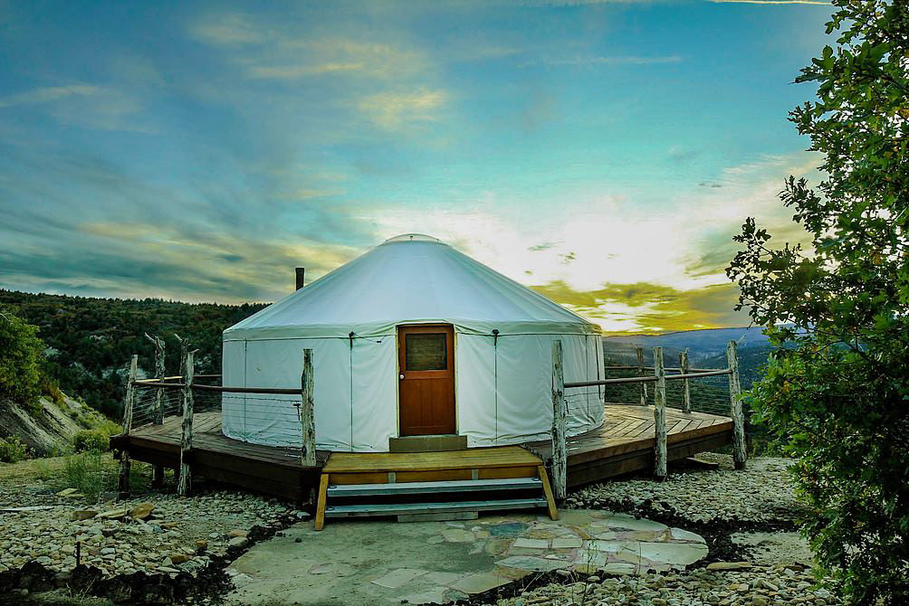
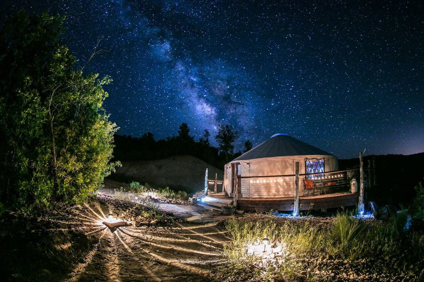
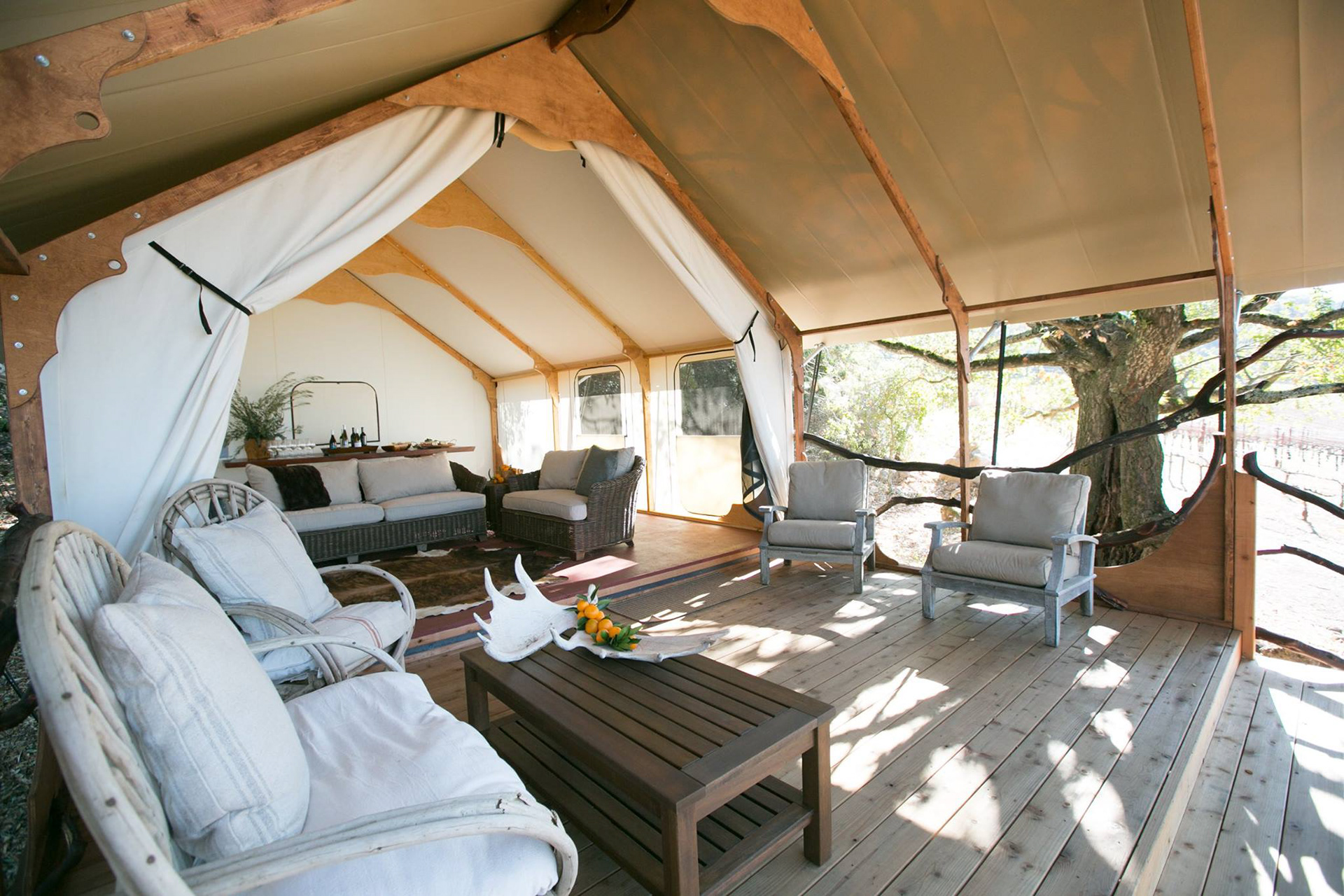
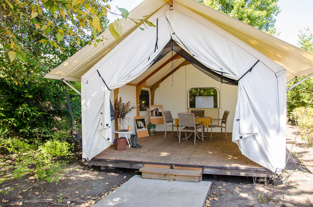
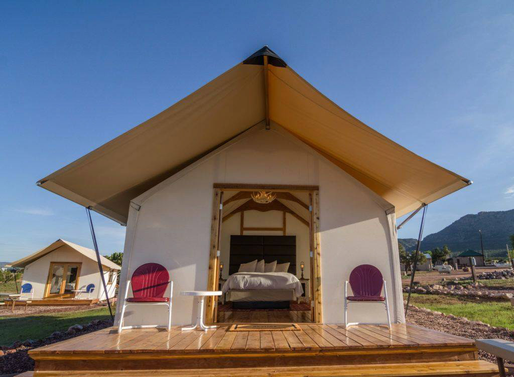
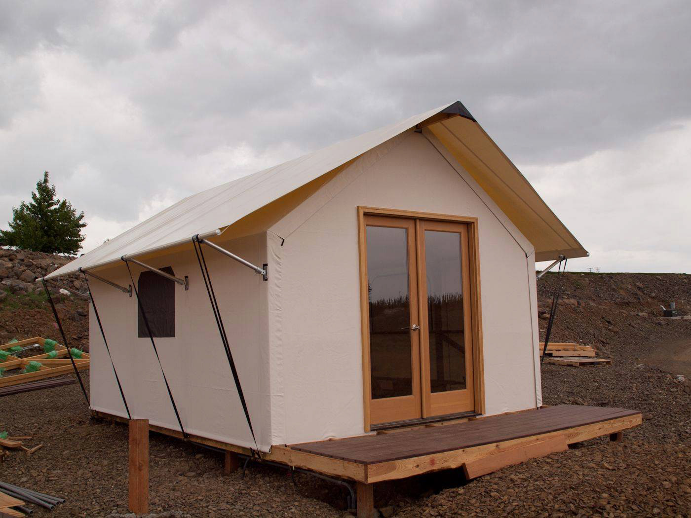
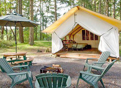
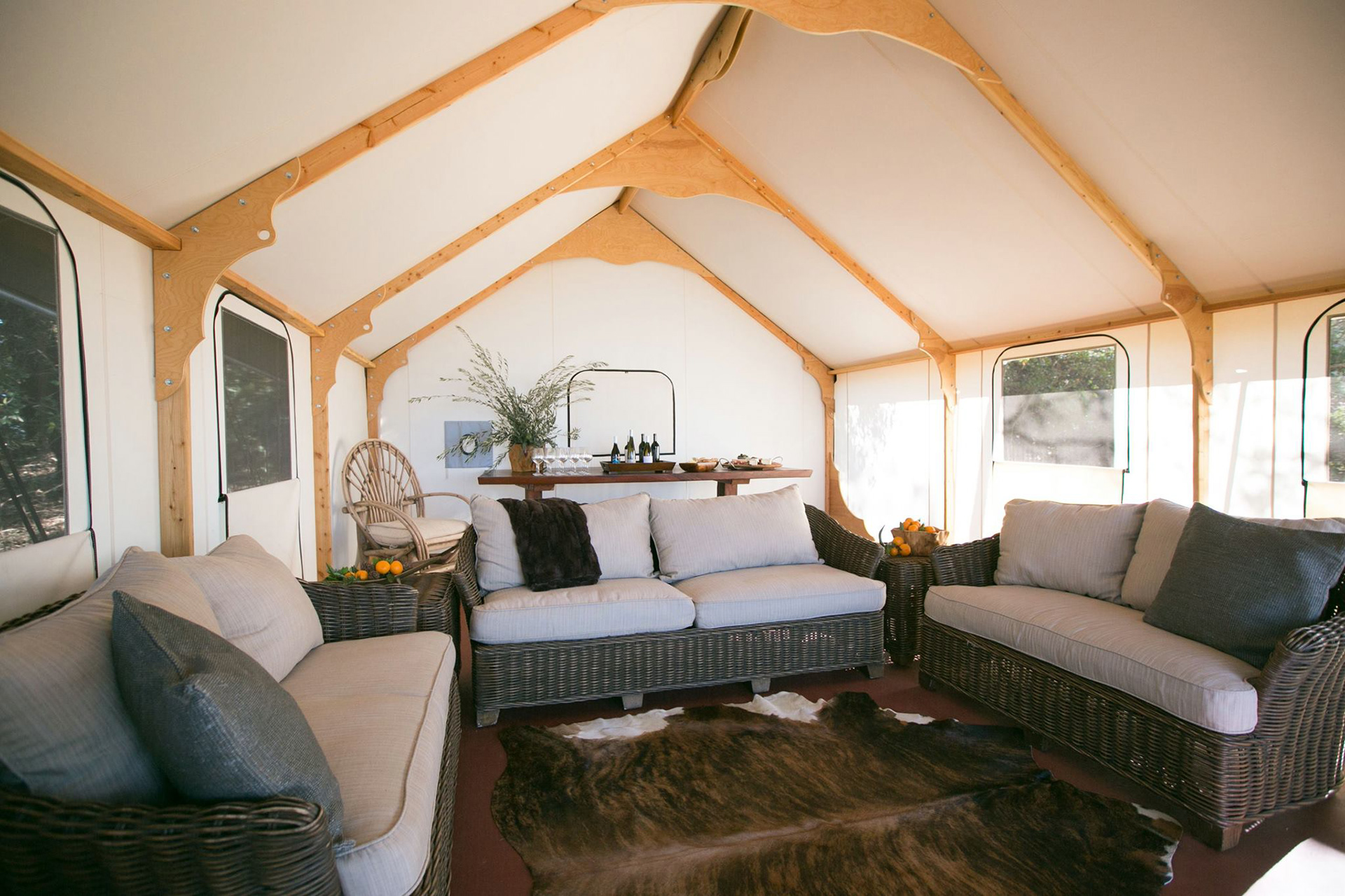
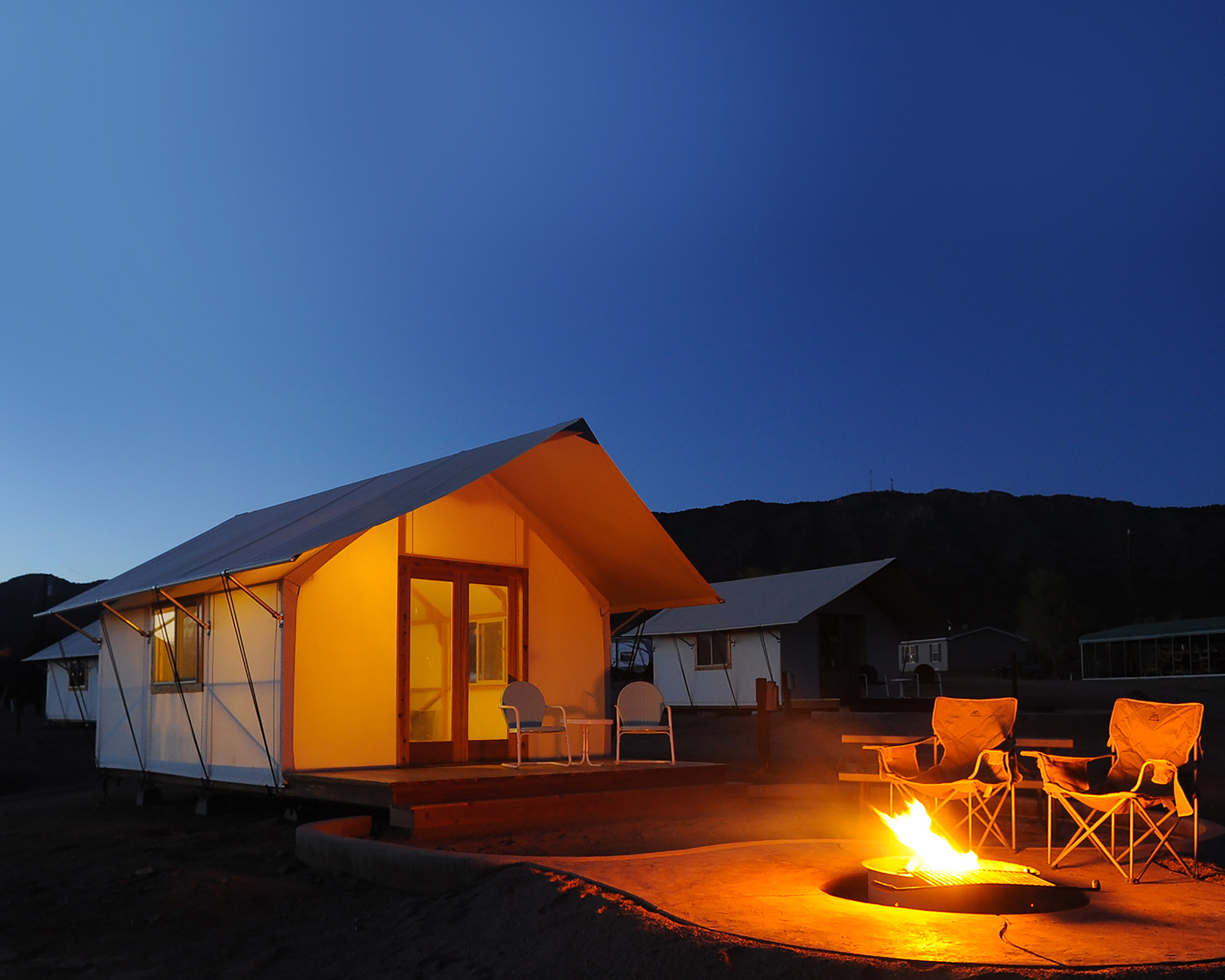
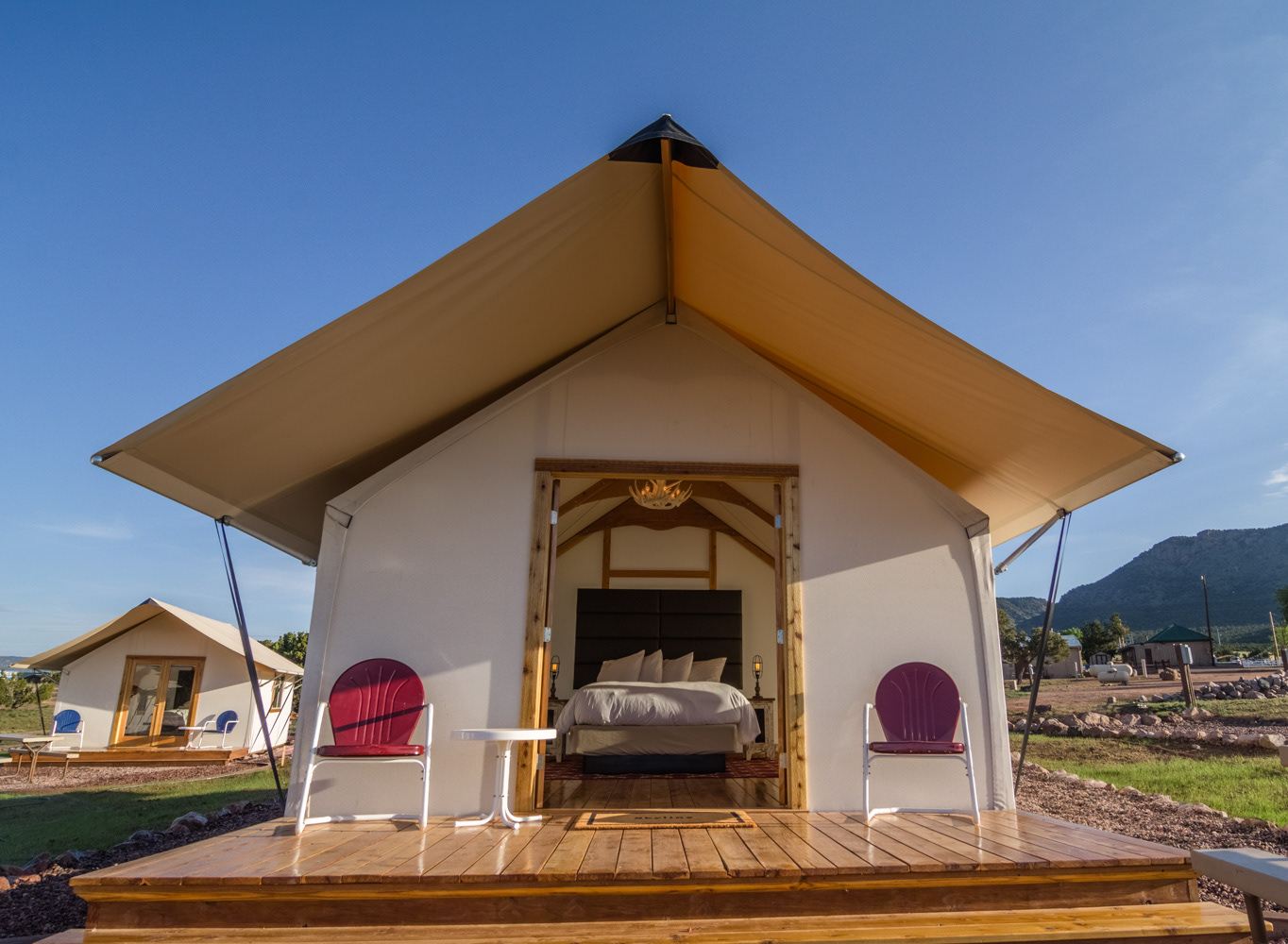
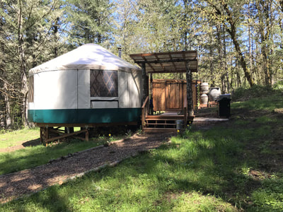
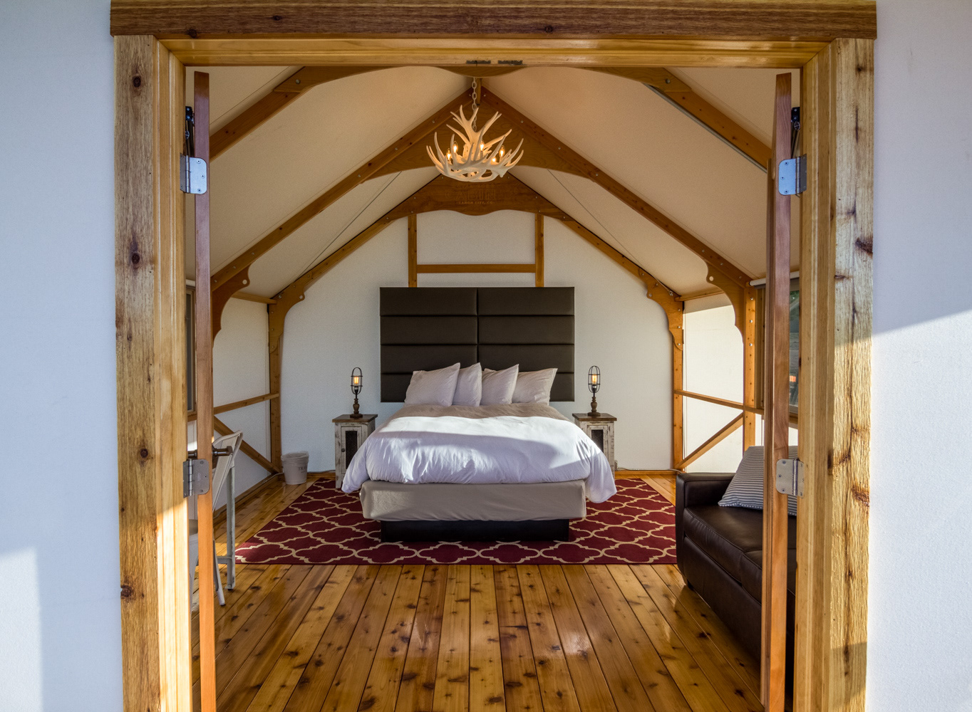
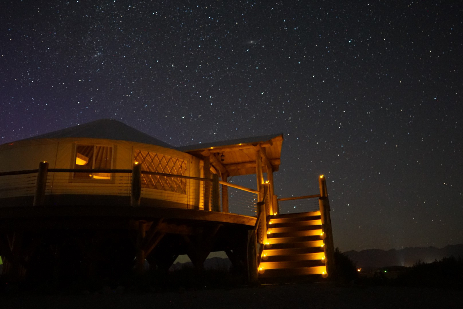
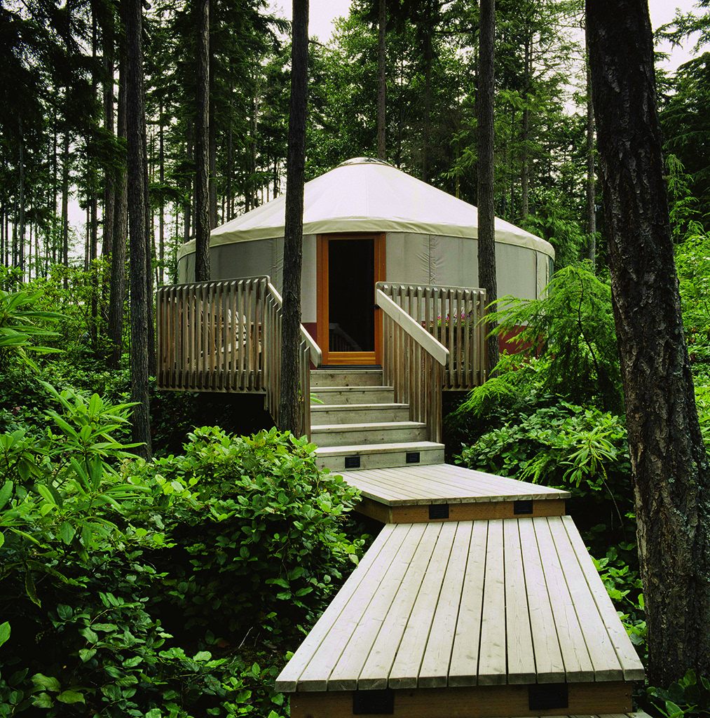
THE ORIGINAL LOGO WAS SIMPLY THEIR CORPORATE LOGO WITH THE WORD RAINIER REPEATED AND THE PRODUCT NAME. THE PRODUCTS THEY SELL ARE PICTURED BELOW.
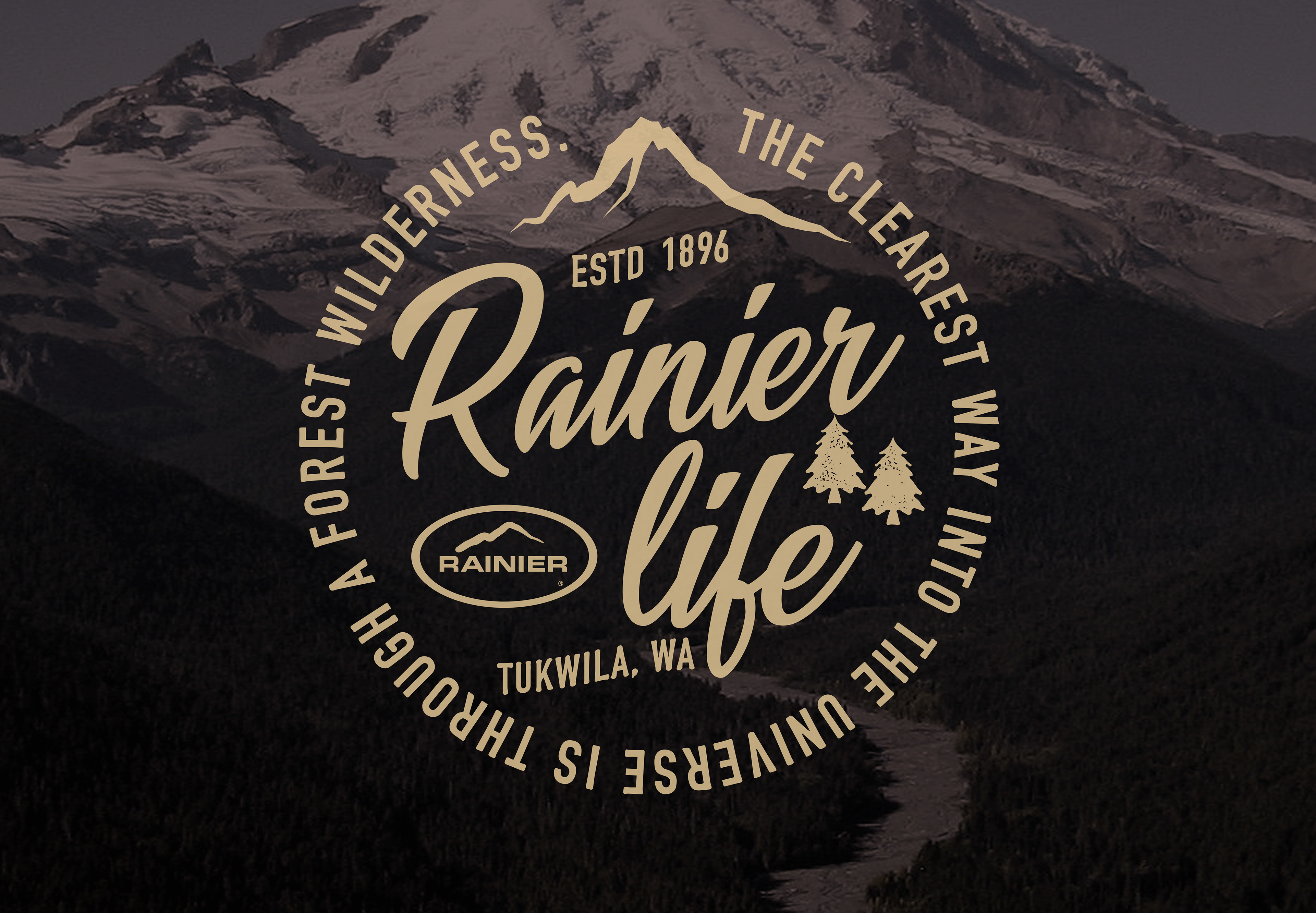
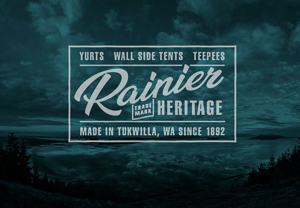
Part of the strategy was to rename the division to have a broader appeal and better reflect the product line. The names Rainier Life, Rainier Heritage, and Rainier Outdoors were considered. Heritage was a key factor. They wanted something that reflected the age of the company and helped cement its position as one of the oldest manufacturers of this type of product. The initial presentation I created showed a variety of possible directions, but they all featured a vintage aesthetic that reflected the heritage and history of the company.
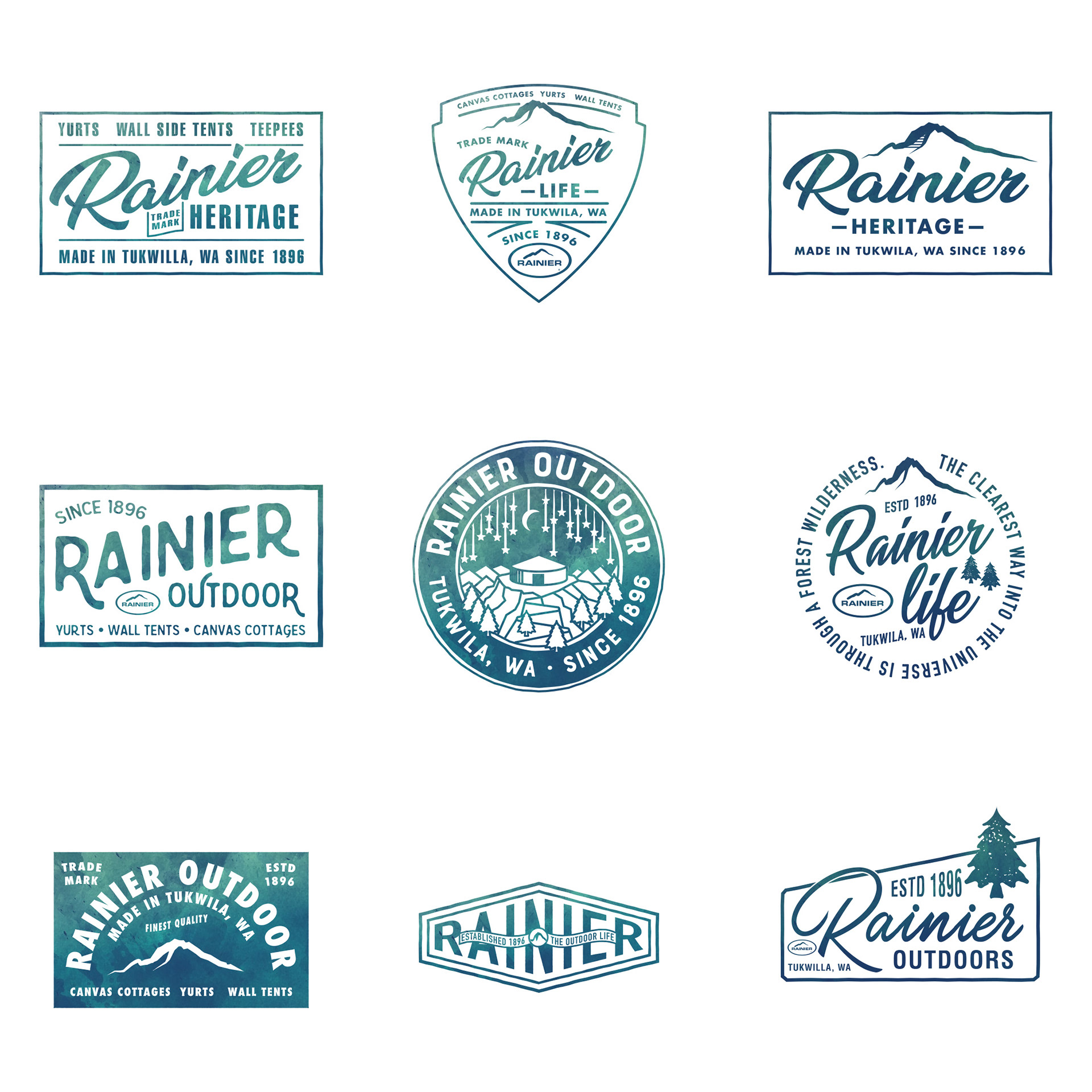
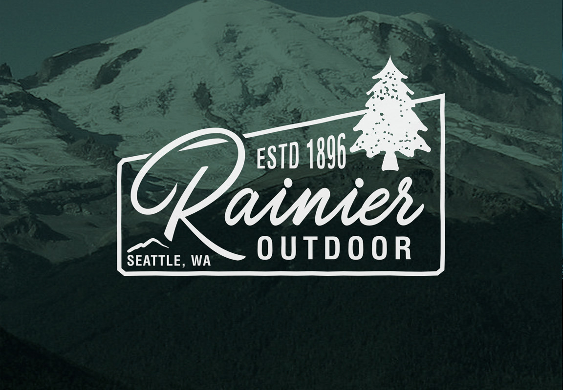
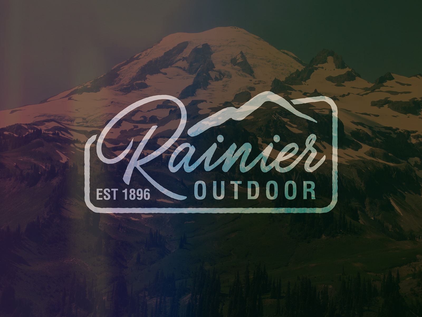
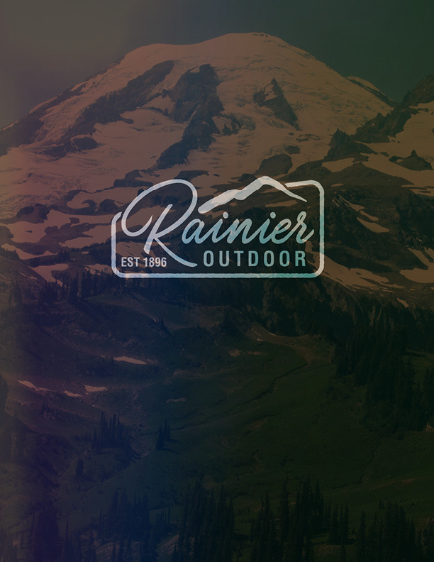
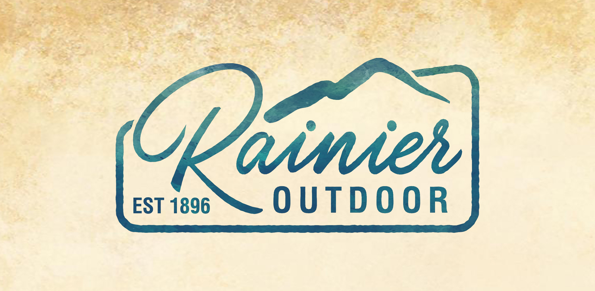
This work was extremely well received but ultimately it was decided that more of the original brand should be incorporated while still maintaining the heritage feel. The name Rainier Outdoor was chosen and the logo below was developed using the mountain from the main Rainier brand oval logo while still incorporating the heritage typography and the watercolor feel developed in the first round.
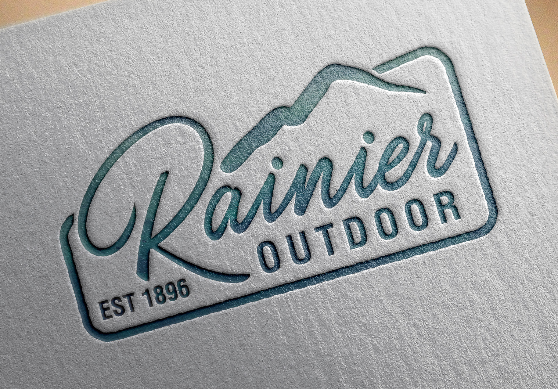
THE FINAL LOGO DESIGN SHOWN HERE. THE MOUNTAIN IS TAKEN DIRECTLY FROM THE MAIN RAINIER LOGO AND INCORPORATED.
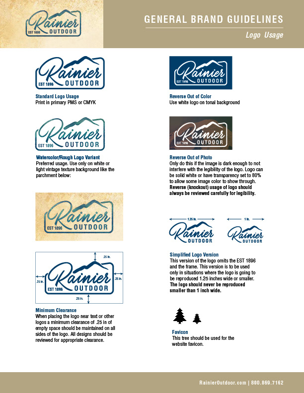
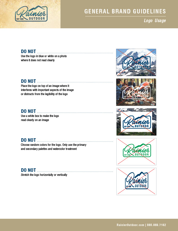
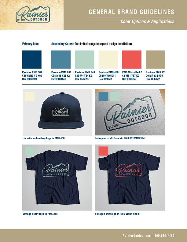
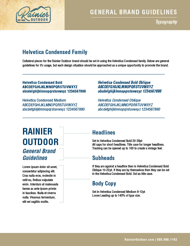
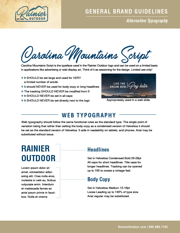
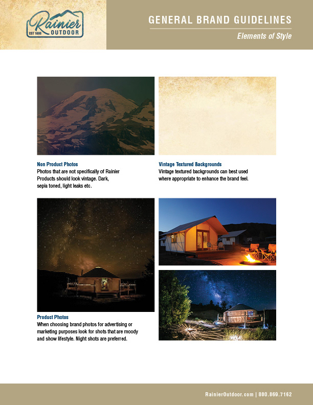
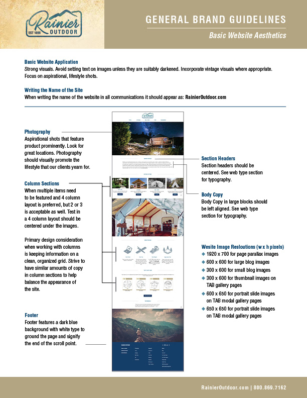
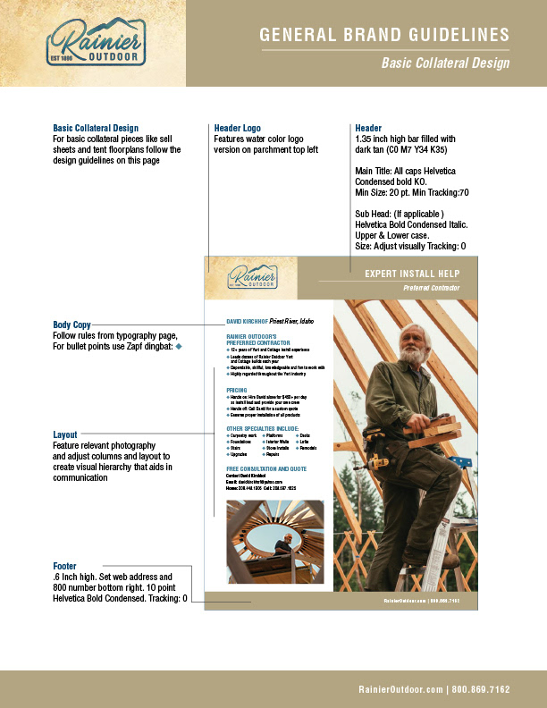
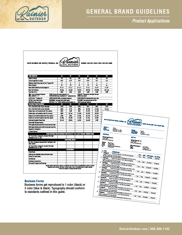
Once the design of the logo was finalized a brand book was developed that show proper application, supporting color palettes, typography, basic collateral applications, etc.
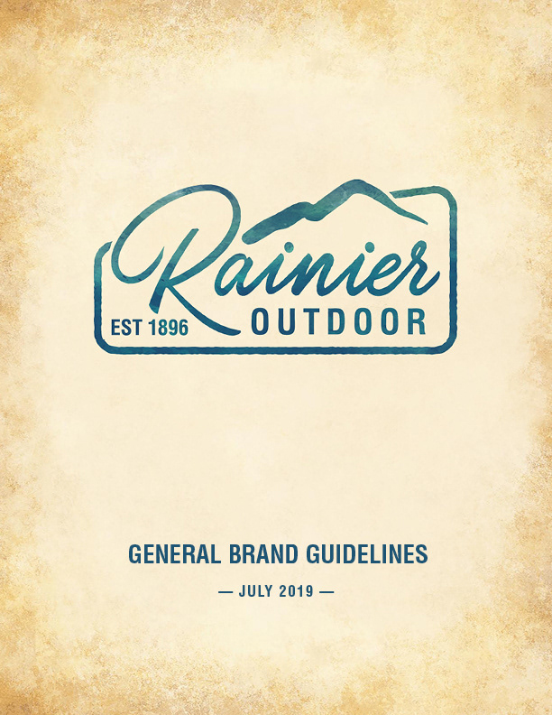
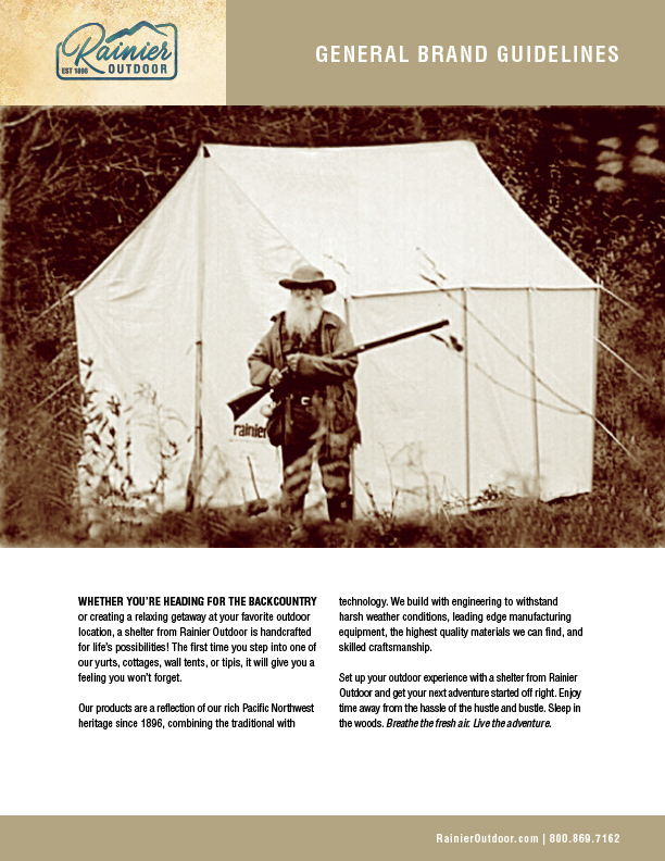
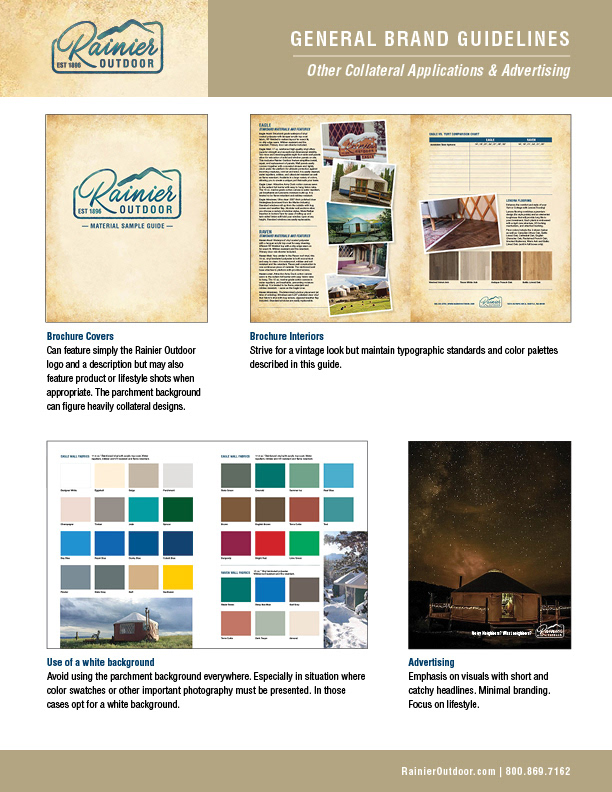
THE PARCHMENT BACKGROUND ABOVE WAS INCORPORATED AS A KEY ELEMENT THOUGH MANY OF THE PIECES, FEATURED HEAVILY ON COLLATERAL COVERS, SELL SHEETS AND MORE.
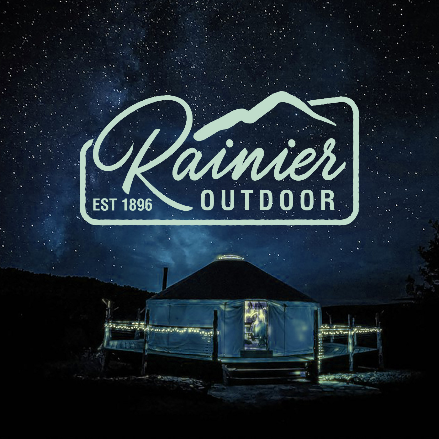
DISTINCTIVE ART WAS DEVELOPED FOR SOCIAL MEDIA
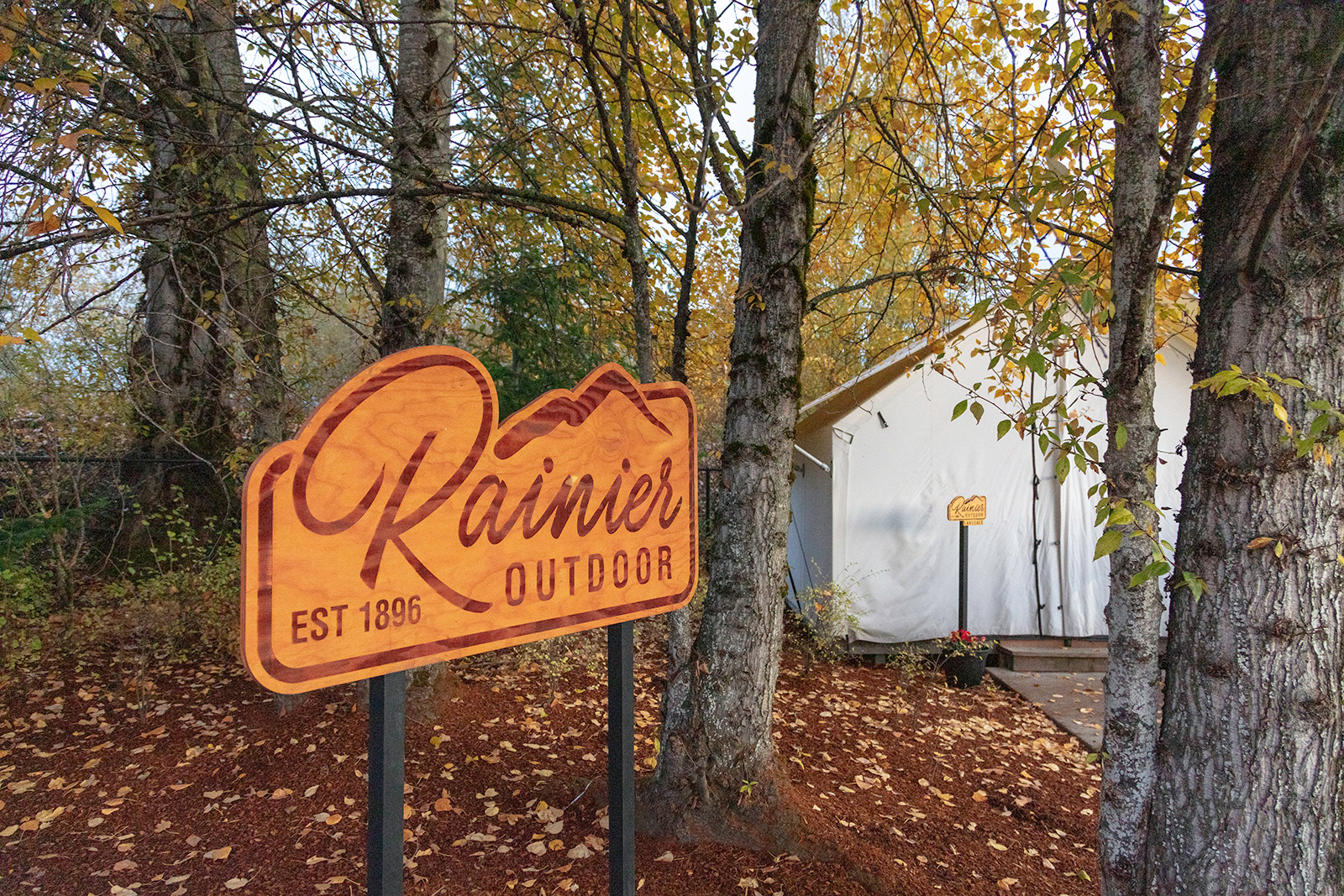
SEEN HERE IN ITS NATURAL HABITAT
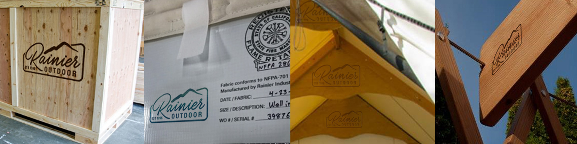
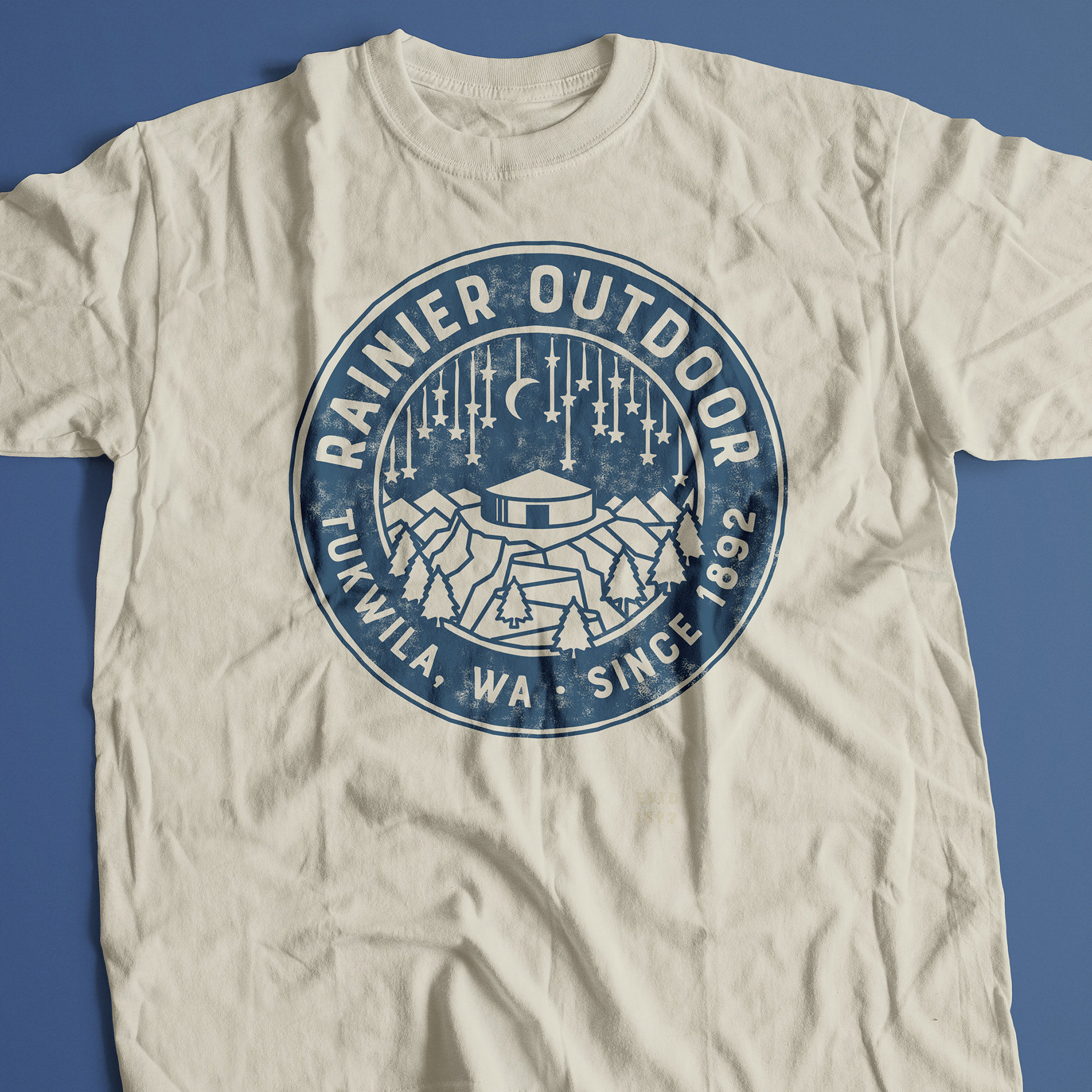
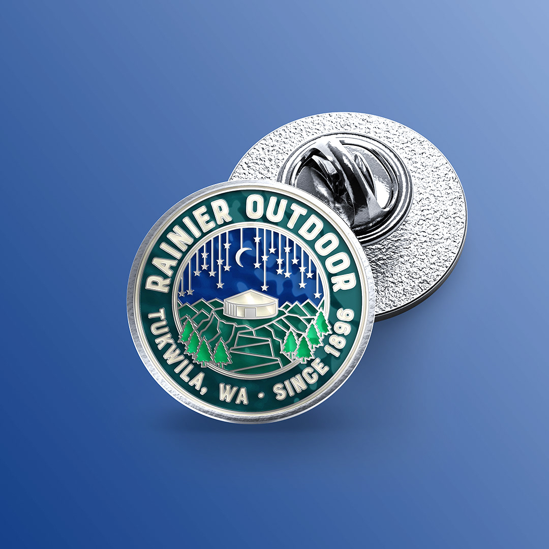
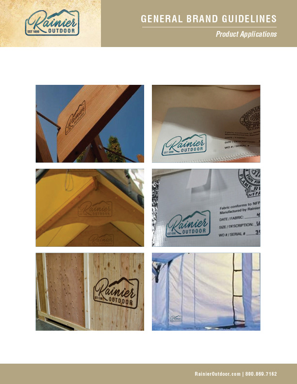
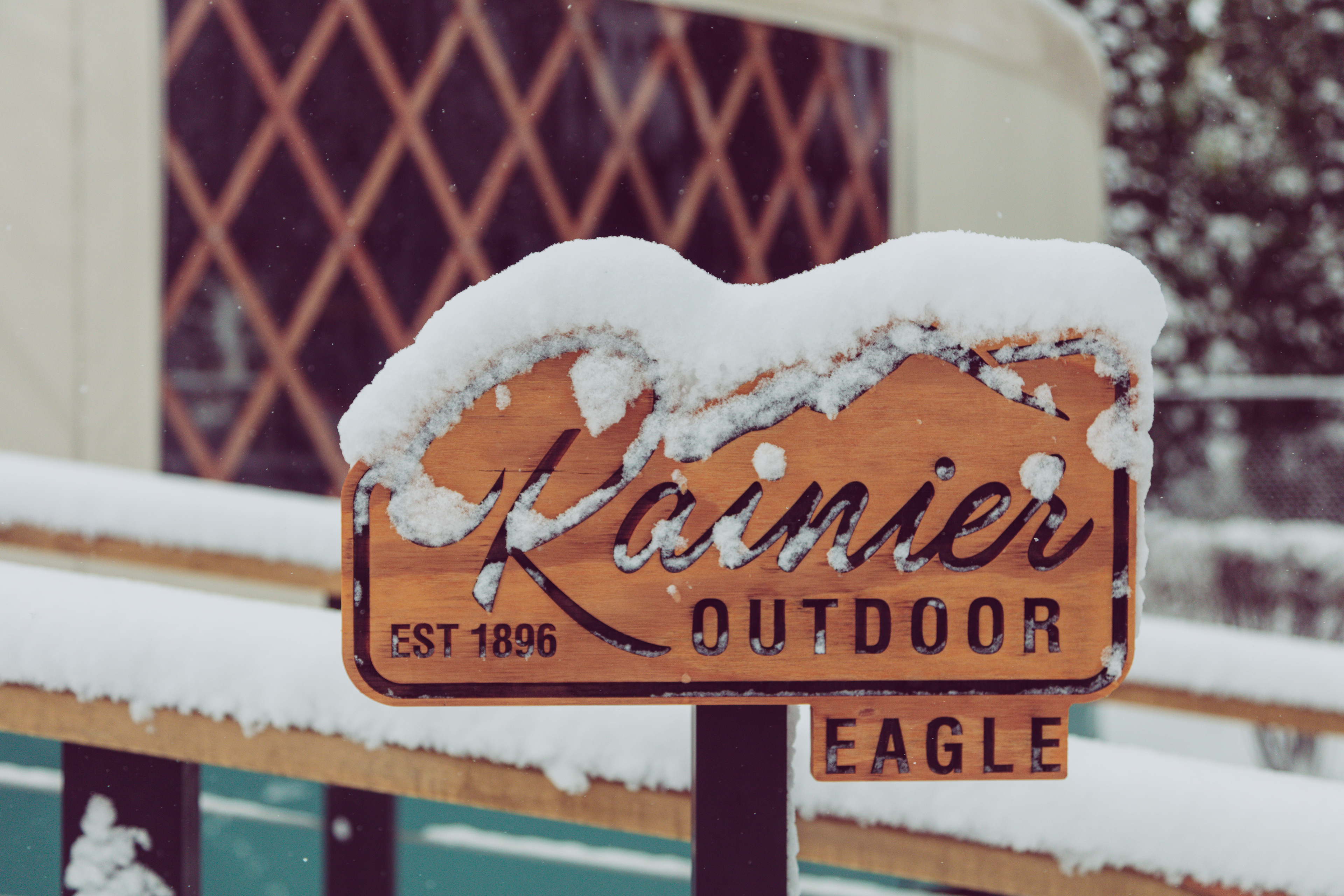
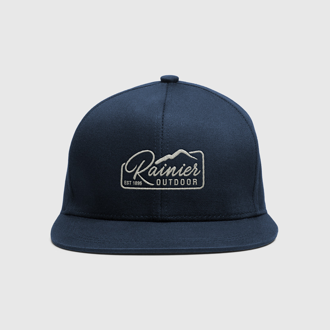
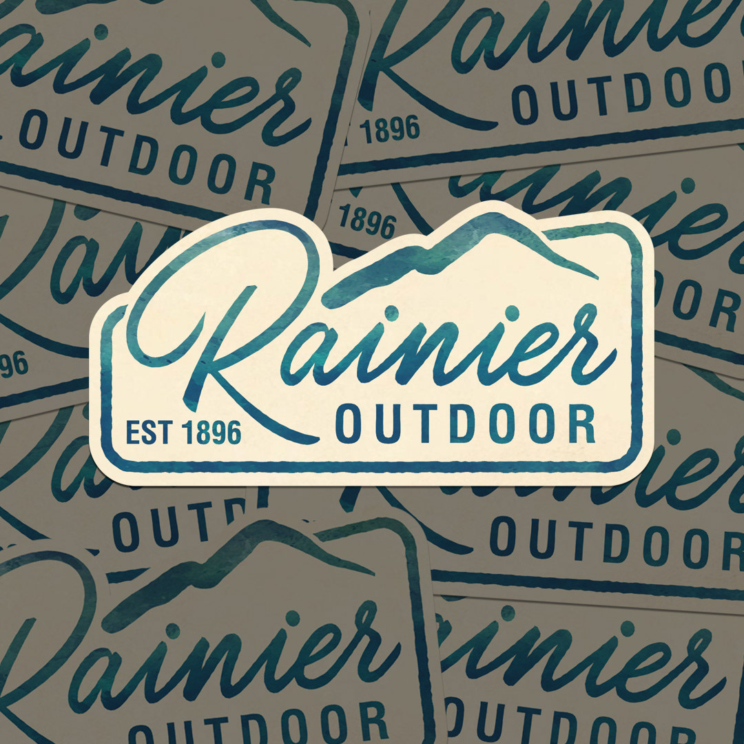
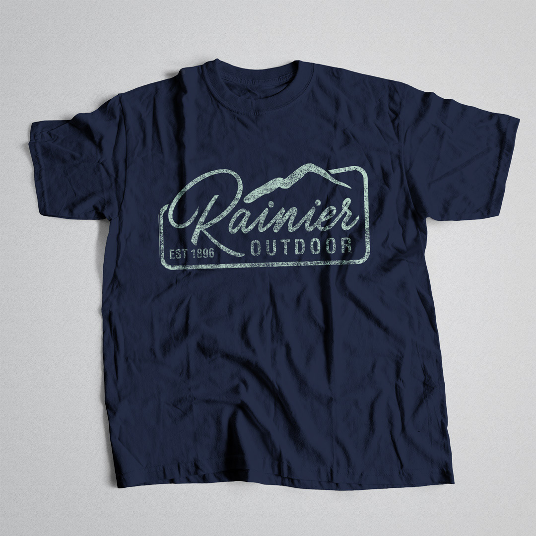
THE BRANDING IS CURRENTLY IN USE IN A MYRIAD OF APPLICATIONS FROM STENCILS TO ACTUALLY BEING BURNED INTO THE WOOD BEAMS OF THE TENT PRODUCTS. IT IS ALSO USED FOR THE PROMOTIONAL AND "FOR SALE" PRODUCTS PICTURED BELOW.
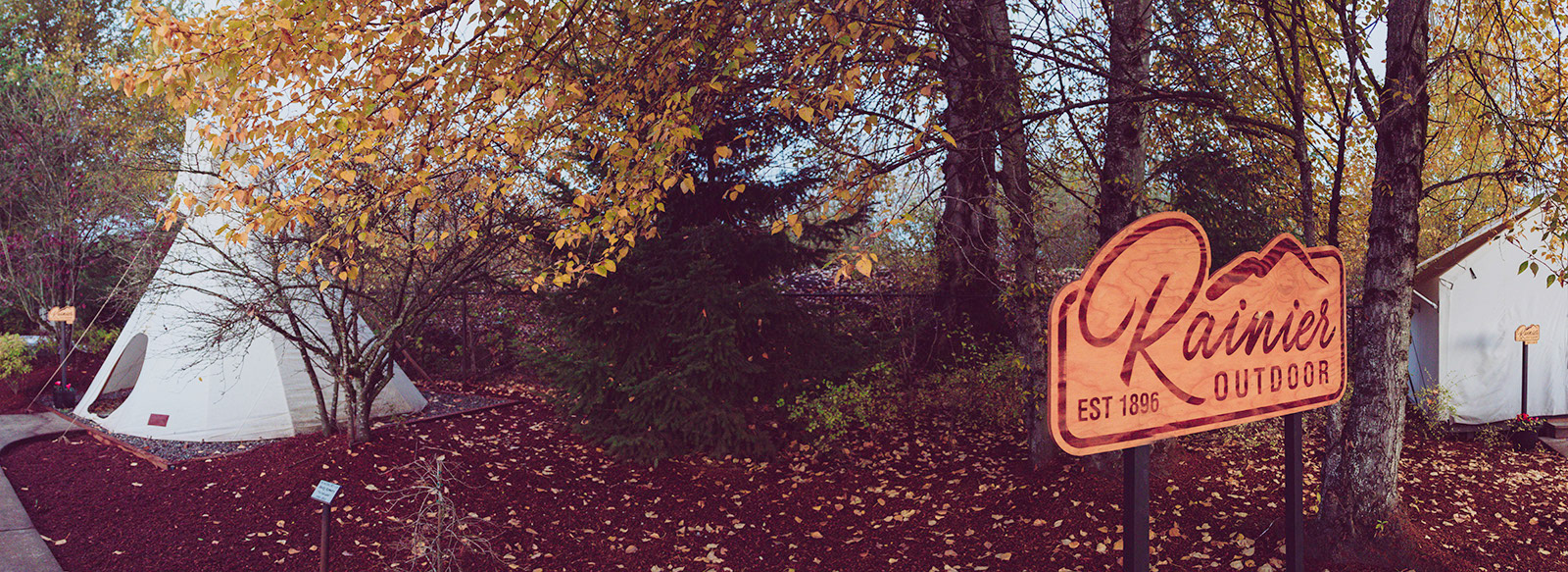
THE BRANDING IS ALSO ALSO USED HEAVILY IN THEIR TENT "SHOWROOM," WHICH IS A WOODED LOT THAT FEATURES ALL THEIR PRODUCTS "IN THE WILD."
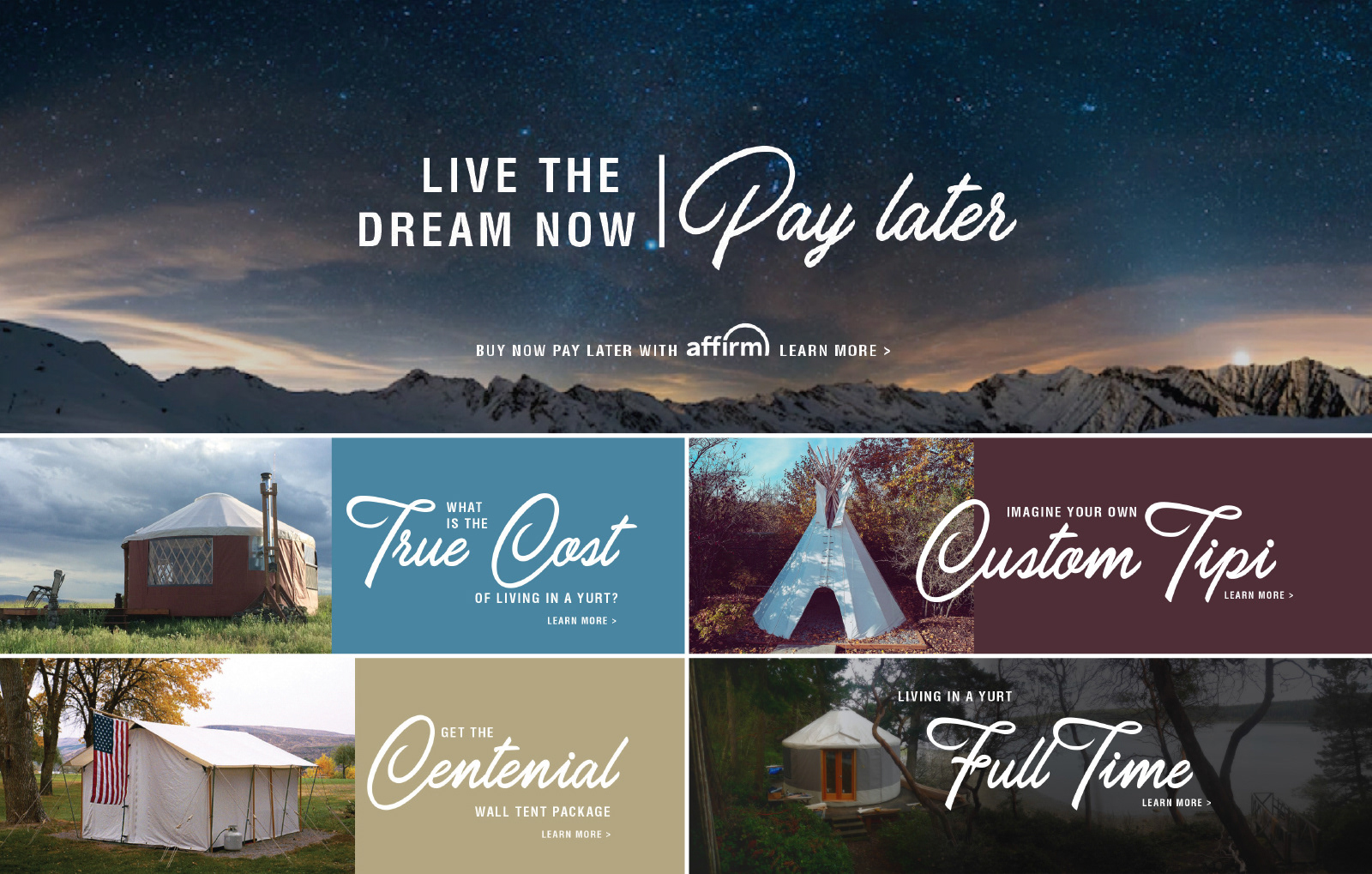
Next up was the website. This was a fully functioning e-commerce site they built inhouse using Magento. I designed the look and feel of it in XD and handed it off to the coders who brought it to life.
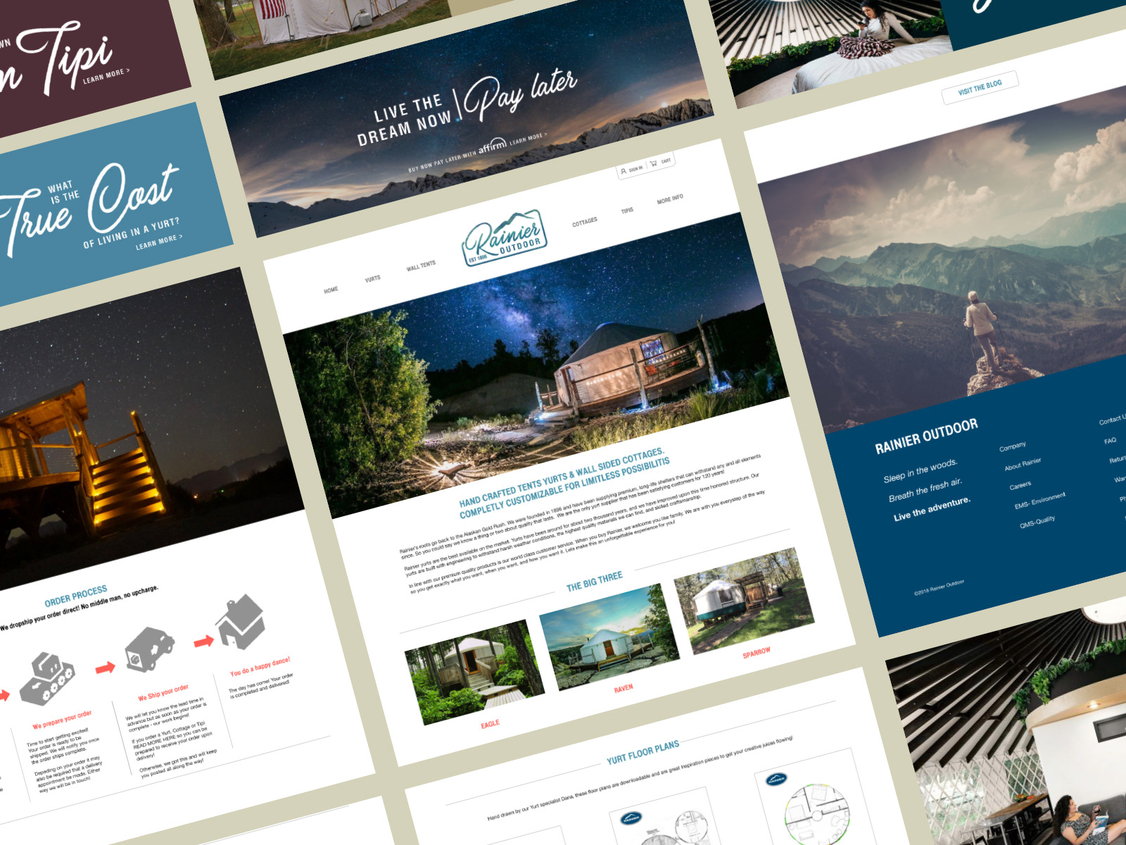
Supporting graphics in the form of slide shows seen below.
Sleep in the Woods.
Breathe the Fresh Air.
Live the Adventure.
Thanks for taking the time to look at this project.